In order for me to complete high standard analysis on a front cover (X2), a contents page (X2) and a double page spread (X2) I will need to use some of the vocabulary shown below which we learnt and discussed in media the other day.
Buzz Words: "Wow", "Exclusive", "Free" are all examples of this.
Puffs: Colourful boxes promoting features inside.
House Style: A magazine's distinctive design that distinguishes it from its competitors.
Strap Line: A slogan.
Banner: Text which stands out on a coloured background generally at the bottom of the magazine.
Copy: The Main Story in the Magazine.
Anchorage Text: The way in which text helps to pin down the meaning of a picture and vice versa.
Pugs: Placed at the top left and right corners of the paper and are known as the 'ears' of the page. The price of the paper, the logo or a promotion are often positioned there.
Motto: Memorable phrase that is recognisable to a customer.
BrandHeadline: Catchy Title for the main article.
Sell Lines: Text on the front cover that helps to sell the magazine to the audience.
Caption: Description of the main image.
Masthead: Name of the magazine.
Lead: The introductory paragraph of an article. Usually written in bold or capitals.
Drop Capitals: Really big letter that starts off an article.
Friday, 5 February 2010
Thursday, 4 February 2010
School Newsletter Analysis

This is the front cover for the Deyes High School newsletter. During the analysis of this front cover I found that in general the newsletter was not appealing on the eye and was maybe a bit to formal for a young audience. My reasoning's for this are as follows:
- There are no eye catching images
- There is no colour
- The logo is faded
- The layout of the newsletter has no shape
- The front cover is kept in the same format and style each month
- There is no masthead for the newsletter, instead a portrait of the school
- The school badge is the main talking point on the front, instead they could have used a headline or an intriguing picture
These reasons clearly show that the Deyes newsletter is more of an information booklet than an actual newsletter, Deyes have designed it in such a way that they just want the parents/guardians to get the message. This means students don't have much to look at in the newsletter. In my judgement the school could do with some variation to the newsletter as they see the contents as the crucial part and the front cover as a 'necessary', but to get people reading the contents they must first catch there eye by using the front cover more appropriately.
College Magazine Mock-Up - Front Cover

This is the mock up of the college magazine front cover that i need to produce, in my judgement this mock up of the leaflet is better than the original leaflet. I believe it is better because instead of having a picture as the masthead on the newsletter i have decided to put the name at the top with the main headline underneath in the middle of the page. Further down is a picture of one of the sixth form classes, this relates to learning and higher aged students in the school, this therefore relates to a 'college magazine'. In my mock up i have added the use of colour, i believe that the colour i have used is much better than the colour used in the original newsletter. i also believe that my layout style for the college magazine is more appealing to young people as it is different and more appealing on the eye.
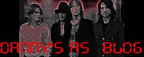
The Genre of my music magazine
I have decided to produce my music magazine using the genre of 'indie', i have decided on this genre as it is the style of music that i generally like and listen to. Below are some bands that i like to listen to, but more importantly are 'indie' based.


Subscribe to:
Posts (Atom)